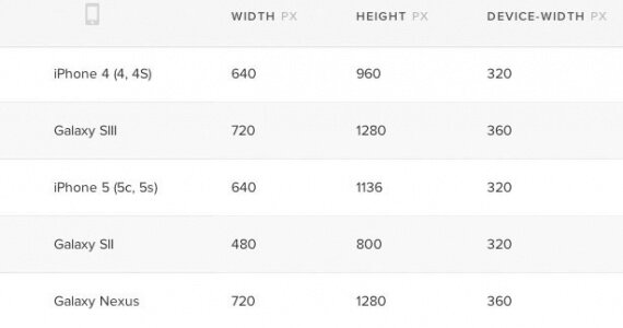
By reference to statistics we will consider five the most popular resolutions of mobile screens resolutions.

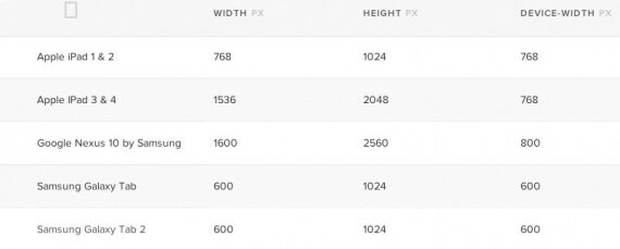
And five the most popular tablet resolutions.

And then media queries are entering the game. For instance, if we add the following code to the style sheet, it will define the site background, provided that a certain device will have 480 or less pixels screen.
@media screen and (max-device-width: 480px) and (orientation: portrait) {
  #background  {
    width: 480px;
    background:url(/img/background.jpg);
  }
}
We can also use CSS-rule @import for the conditional loading of stylesheets into the current stylesheet. For example, the following code imports the phone.css, provided that a certain device will have the screen and the display area of maximum width 480 pixels.
@import url("phone.css") screen and (max-width:480px);When creating responsive web-designs the most commonly used media queries are about display area width and device screen width (device-width).
- width — the display area width.
- height — the display area height.
- device-width — width of the surface on which rendering occurs (it’s the device screen width for us).
- device-height — height of the surface on which rendering occurs (it’s the device screen height).
- orientation — orientation of the device screen (portrait or landscape).
- aspect-ratio — ratio of the width and height depending on the display area width and height. A widescreen display with sides’ ratio 16:9 can be marked as aspect-ratio: 16/9.
- device-aspect-ratio — similar to the aspect-ratio, but it’s based on the width and height of the device surface, on which rendering occurs, and not on the width and height of the display area.
All the features mentioned above can be provided with the prefix min or max to define the range. Look at the following piece of code:
@import url("phone.css") screen and (min-width:560px) and (max-width:1136px);Minimum (min) and maximum (max) were defined in the media queries to define resolution. File phone.css will be imported only when it’s referred to devices with the minimum display area width of 560 pixels and maximum display area width of 1136 pixels.
And finally the most convenient media queries for Apple products.
iPhone < 5:
@media screen and (device-aspect-ratio: 2/3) { your styles }iPhone 5:
@media screen and (device-aspect-ratio: 40/71) { your styles }iPad:
@media screen and (device-aspect-ratio: 3/4) { your styles }
0 comments
Upload image